Media queries are an extension to HTML5 that allows features of a user’s display to determine the CSS delivered to the device, as defined by the CSS3 Module. device in portrait orientation with a viewport width of 320px can be detected and given different styles compared to a desktop device with a viewport width of 1024px. Conventionally, the different styling would normally be restricted to layout, backgrounds, and images; in essence, a completely new set of styles can be delivered.
As in media types, there are three ways to invoke media-query-dependent styles. First of all, as stylesheets in the link element of HTML or XHTML:
<link rel="stylesheet" type="text/css" media="all and (color)" href="/style.css">
Secondly, in XML:
<?xml-stylesheet media="all and (color)" rel="stylesheet" href="/style.css" ?>
And finally, in CSS stylesheets using @import rules:
@import url("/style.css") all and (color);
Or using @media rules:
@media all and (color) { /* one or more rule sets… */ }
Once again, responsive web design is providing the tools to create a fire-and-forget approach that produces layouts we can trust. It leaves us free to concentrate on the content that keeps our users returning to our applications.
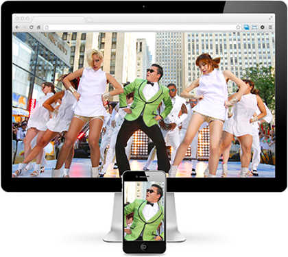
As we can see from Figure below, modern devices have vastly distinct capabilities and requirements when it comes to assets and styling. Luckily, the syntax for media queries is straightforward.

Figure : The image assets in their target devices
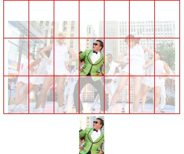
We typically try to limit the CSS delivered to each target. Starting from styles that are common, we build device-specific styles. But it’s not just the styles themselves that we target, there are also the assets delivered by those styles. Figure (below) shows that if we send the 1920px-wide background to our 320px-wide display from Figure (above), we’ll be sending an asset around 14 times larger than required. That’s a bandwidth and performance hit to your application that you can easily do without.Let’s take a look at a media query that will target the iPhone 5:

Figure : Our small image fits approximately 14 times in our large image
@media only screen and (min-device-width: 640px)
  and (max-device-width: 1136px)
  and (max-device-width: 1136px)
  and  (-webkit-min-device-pixel-ratio: 2) {
     /* iPhone 5 only – at least for now */
}
By now, that syntax is going to be looking partly familiar at the least. We’ve seen device-width in our viewport meta element, and device-pixel-ratio in the picture element from adaptive images. And as if that weren’t enough, media queries are the cousins of media types that were released in May 1998 as part of the CSS2.0 recommendation.
Exploring Media Features
You can do a lot with media queries even if you just rely on device-width. Remember, though, that you can look at features other than a device’s width. There are currently 13 media features catered for in the specification: width, height, device-width, device-height, orientation, aspect-ratio, device-aspect-ratio, color, color-index, monochrome, resolution, scan, and grid. All but orientation, scan, and grid can accept min- and max- prefixes as well. The level of control you have is refreshing—and a little awe-inspiring!
If you were yet to be in awe of the number of options before you, remember that as the media query features are controlled by CSS, browser vendors can add vendor-prefixed additions to that list; for example, -webkit-device-min-pixel-ratio, which is Apple’s addition to enable you to target its Retina devices. And don’t forget that there are many more we can access beyond -webkit-:
@media only screen and (-webkit-min-device-pixel-ratio: 2)
  and (min-width: 320px),
  only screen and (min--moz-device-pixel-ratio: 2)
  and (min-width: 320px),
  only screen and (-o-min-device-pixel-ratio: 2/1)
  and (min-width: 320px),
  only screen and (min-device-pixel-ratio: 2)
  and (min-width: 320px) {
    /* Small screen retina/amoled styles */
}
Just like standard vendor-prefixed styles, the last property has no vendor prefix in the hope that one day property alone will be enough to reach our target devices.
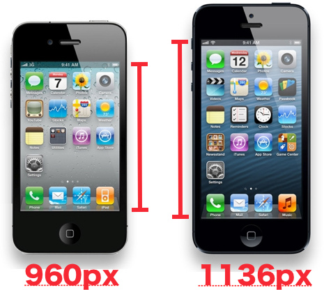
Gone are the days when handheld would get you out of trouble. Today, you need to consider all your options for targeting devices and judge how to balance your design and development budgets. And that’s a judgment that’s becoming harder and harder to make with the constant temptation to over-specify queries. With the release of Apple’s iPhone 5 with iOS6, the new handset gained an extra 176px in height. It’s unlikely you’d be targeting iPhones using max-device-height: 960px—however, if you did, you’d have missed all the iPhone 5s that viewed your application. Consider Figure (below).

Figure : Size comparison of iPhone 4 and iPhone 5 screen heights
True, you can now differentiate iPhone 5 from its predecessors by using device-height, but you need to balance that against the possibility that the footer you so painstakingly fixed to the bottom of the screen in iPhone 4S and below will now eerily float 176px above the bottom of the screen. We also need to consider that if the iPhone 5 gained an extra 176px, what can we expect from the iPhone’s next generation? Or the one after? Remember our goal: to trust that our style will just work on any device—present or future—without having to rewrite code with each new size.
That being the case, it could be worth a quick look at the syntax we use to pick between features. A media query list is a comma-separated string that uses a series of media queries to target device features:
<link rel="stylesheet" media="screen and (color), projection and (color)" rel="stylesheet" href="example.css">
If at least one media query in a media query list is true, the list is considered true and any true feature matches will be honored. For example, if the screen and (color) media query in a media query list such as "screen and (color), projection and (color)" in the previous code example is true, the list is regarded as true.
The comma separating each media query expresses a logical OR, and each query can use the and keyword to express a logical AND. For the OR query to match, either feature must be present and for the AND query to match, both features must be present. The previous query caters for when your application is viewed on either a screen or projector that’s capable of displaying color. If the device falls within that range, it will receive the contained CSS styles.
The not keyword can be used to exclude a feature, so this next query will target iPhones but NOT those with Retina displays; it will catch an iPhone 3 but not an iPhone 5, for example:
@media only screen (min-device-width: 640px) and
not (-webkit-min-device-pixel-ratio: 2) {
     /* stylesheet for non-high density phone goes here */
}
All in all, the media query syntax is straightforward and can be readily understood and simply read, as long as you keep an eye out for those implicit logical ORs. Had the W3C and WHATWG opted for the picture element over the image’s src-set attribute, the extra exposure that the media query syntax would have gained would have made investment in learning it even more valuable.
Query Feature Support
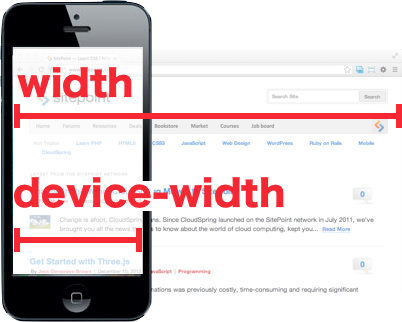
You can go a long way with media queries concentrating largely on dimension-based features—width and height, and device-width and device-height. These have the twin benefits of being both easy to understand and widely supported by browsers. Well, easy to understand as long as you remember that width is the width of the browser, and device-width is the width the device reports, as shown in Figure (below).

Figure : Comparison of width and device-width
Let’s look through the remaining features for an idea of how we can use them:
orientation accepts either portrait or landscape
aspect-ratio such as 16:9, or 4:3
resolution the Dots Per Inch (DPI), or Dots Per Centimetre (DPCM)
scan a display type that targets televisions that use progressive scanning
grid matches Teletype displays or devices that only show a single fixed font
monochrome checks the number of bits per pixel in a monochrome frame buffer, with 0 being falsey
color checks the number of bits per color of the device, with 0 being falsey
color-index checks the number of entries in the color lookup table of the device, with 0 being falsey
For a thorough grasp of features, you’ll need to master the device’s aspect and resolution, which way it is rotated, and whether it displays in color. These are all terms you’d be familiar with when you’ve created graphics for the Web. Once again, we’re back on familiar turf with the HTML5 specification drawing on typical terms when it sets the standard. It makes the learning curve so much more approachable.
While support may vary on features, even the non-dimension-based features are within our reach, as the terminology used is relevant to the target industries. scan and grid might not be immediately obvious to today’s desktop-focused designers, but those features are targeted to other devices, and those terms are second nature for developers of such devices. If your work targeted television displays, for example, you’d be well-acquainted with scan and progressive scanning.
What happened to media types?
It’s important to remember that while we’re concerned here with responsive web design, there are other considerations that can and should impact your application. Just because we’re undertaking RWD, doesn’t mean we’d overlook accessibility, internationalization, or how your application appears on non-Web displays.
As a result, our queries will most often have screen as the media type, but keep in mind that there are other possibilities!
As using media queries and query lists is the best way to understand how to deal with them.

